 Okay, a little blatant self-promotion:
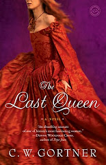
My cover art for Ballantine Books (US) of THE LAST QUEEN has arrived. I must say, I love it. I think it evokes Juana of Castile's mystery perfectly. I also have my UK cover art - well, actually a draft of it, on the left. I'm told it will undergo some PhotoShop magic, but the image is
 there. The contrast between the publisher approaches is fascinating: for different reasons, I like both. THE LAST QUEEN will be released on July 29, 2008 in the US and in October (tentative date) in the UK. I don't have Spanish, Italian or German cover art yet, but when I do, I'll post it. Hope you enjoy!


8 comments:
Cover art looks great! Def' like the one on the left.
Interesting. Thanks, Justin. I prefer the US cover (right) a little more because I'm very partial to portraiture, but everyone has a different reaction and the left cover, the UK one, definitely elicts reaction. Maybe because of the immediacy of the photo?
I think I like the UK one a little more because, from my experience, a lot of historical fiction has that portraiture-esque cover (understandably so; portraits bring up thoughts of antiquity); so to find a novel that's cover is more of a photo and less of a portrait stands out from the rest, I think. It makes me think, "O0o0o, this is different."
I could be the only one who thinks that, haha. :-)
Both covers are great, though. I hope the book does very well for you. I look forward to reading it.
Beautiful! I prefer the US cover myself, but they're both good-looking.
Thanks for your comments! I do see your point of view, Justin: three of my friends feel the same way you do, actually. They really like the fact that the model, in her flaming orange dress, resembles my description of Juana in the book. It's interesting to get these reactions and I really appreciate those of you who've posted your insights here; everyone experiences art in such a unique manner. I'm glad that so far, no one has been indifferent to the covers. These days, a new book needs all the help it can get :)
Looking forward to reading the book. Juana of Castile is an interesting subject for a novel. And I actually like both covers. It would be hard to choose, they are both beautiful for different reasons.
Both are great covers, but I kind of like the US one better too. It is so interesting to see how the same book is "packaged" differently from country to country.
I love both covers--each for different reasons--the UK cover invites us behind the scenes, history and all its hidden secrets are hovering there. The portrait version is very strong too. Definitely would pick up the book and read it for many reasons--mostly because you are a great writer!
Congratulations on your success.
Linda Joy
Post a Comment